CHALLENGE
Too much information. Not enough guidance.
Finding the right answer often meant navigating a maze of categories and articles.
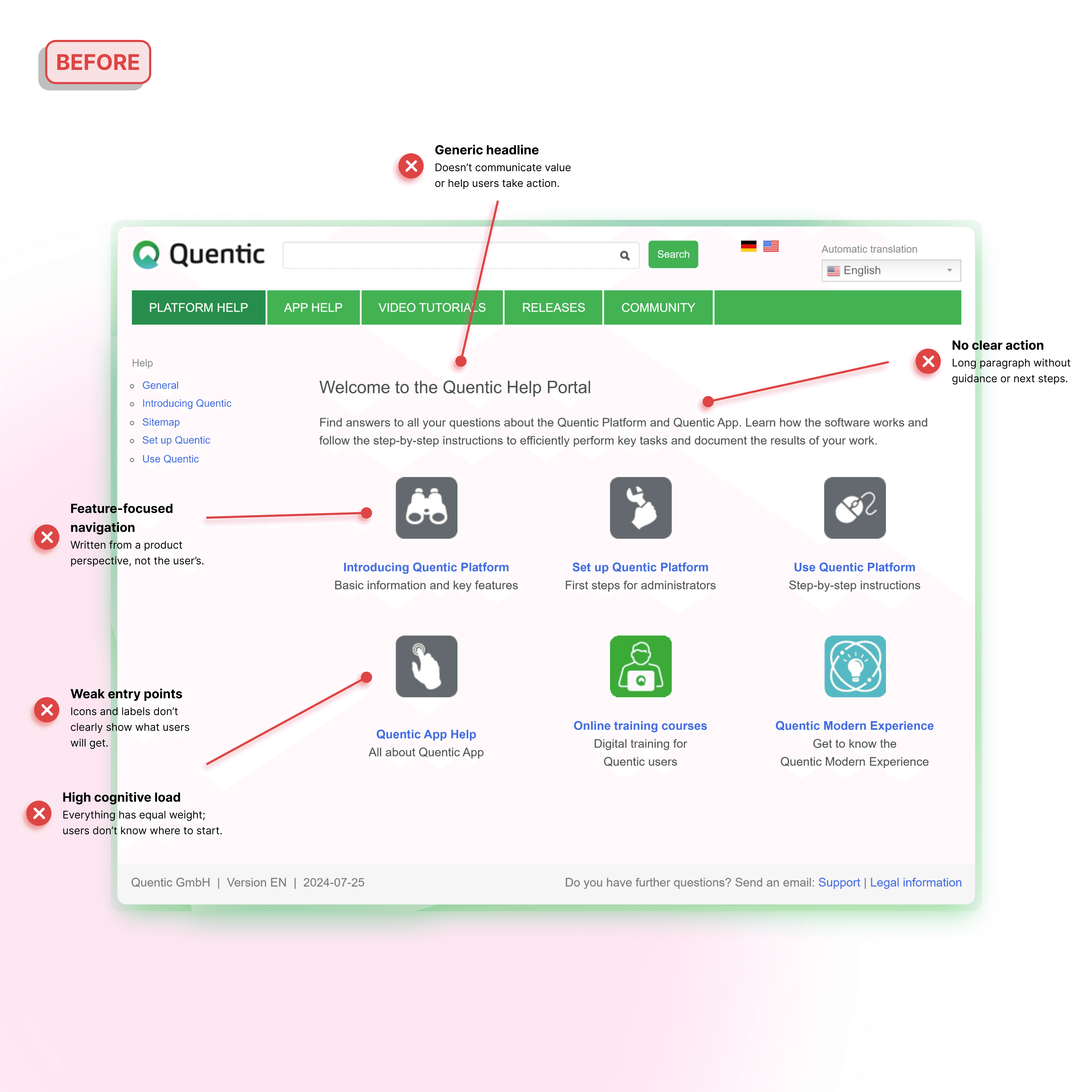
Quentic's help center had evolved into a large and comprehensive documentation ecosystem. While rich in information, users often had to navigate deep category structures, lengthy articles, and product-focused navigation before finding the guidance they needed.
By redesigning the help portal, restructuring article templates, and introducing a more intuitive information architecture, the experience shifted from information-first to task-first—helping users get to the right guidance faster and complete their work with confidence.
Year
2025-2026
Scope
Content Strategy, Technical Writing
01_ Help portal redesign
The original help portal was organized primarily around content categories. While comprehensive, it required users to know where information lived before they could find it. The redesign prioritized common tasks and user goals. Quick actions, guided entry points, and clearer navigation pathways helped users reach relevant information faster and with less effort.
Introduced task-based navigation
Surfaced common user actions directly on the homepage
Reduced dependency on deep category structures
02_ Help article redesign
Many articles contained valuable information, but dense layouts and inconsistent structures made them difficult to scan. Users often had to read large sections before finding the answer they needed. The new article template focused on clarity and actionability. Information was reorganized into predictable sections, visual hierarchy was strengthened, and procedural guidance became easier to follow.
Clear step-by-step structure
Improved readability and scanning
Consistent patterns across all documentation
03_ Information architecture redesign
The original help portal mirrored the internal structure of the software rather than the goals users were trying to achieve. While comprehensive, it required users to understand the product before they could find the information they needed. The redesigned information architecture prioritized user goals, common tasks, and learning pathways. By introducing task-based entry points and clearer navigation patterns, the experience became easier to navigate, learn, and scale.
Task-based navigation
Clear learning pathways
Reduced content complexity