Quentic is an integrated B2B software solution that provides EHSQ and ESG management solutions for greater compliance and better safety. It's complex and has a wide range of users.
Role: UX Writer
When navigating the intricacies of occupational health and safety, clarity and simplicity of language is paramount. The words used must strike a delicate balance between being accessible to users and ensuring accurate and comprehensive documentation. By prioritizing simplicity and tone, the software fosters user confidence, enabling users to engage with critical compliance and safety protocols with ease and clarity.
Key achievements:
- Increased user engagement by optimizing microcopy based on click rate analysis and user interviews.
- Developed multilingual content strategies to support the software's availability in 35+ languages.
- Implemented user-friendly help documentation to reduce support queries and enhance user autonomy.
- Collaborated with product and design teams to ensure consistent brand voice and tone across the software and app.
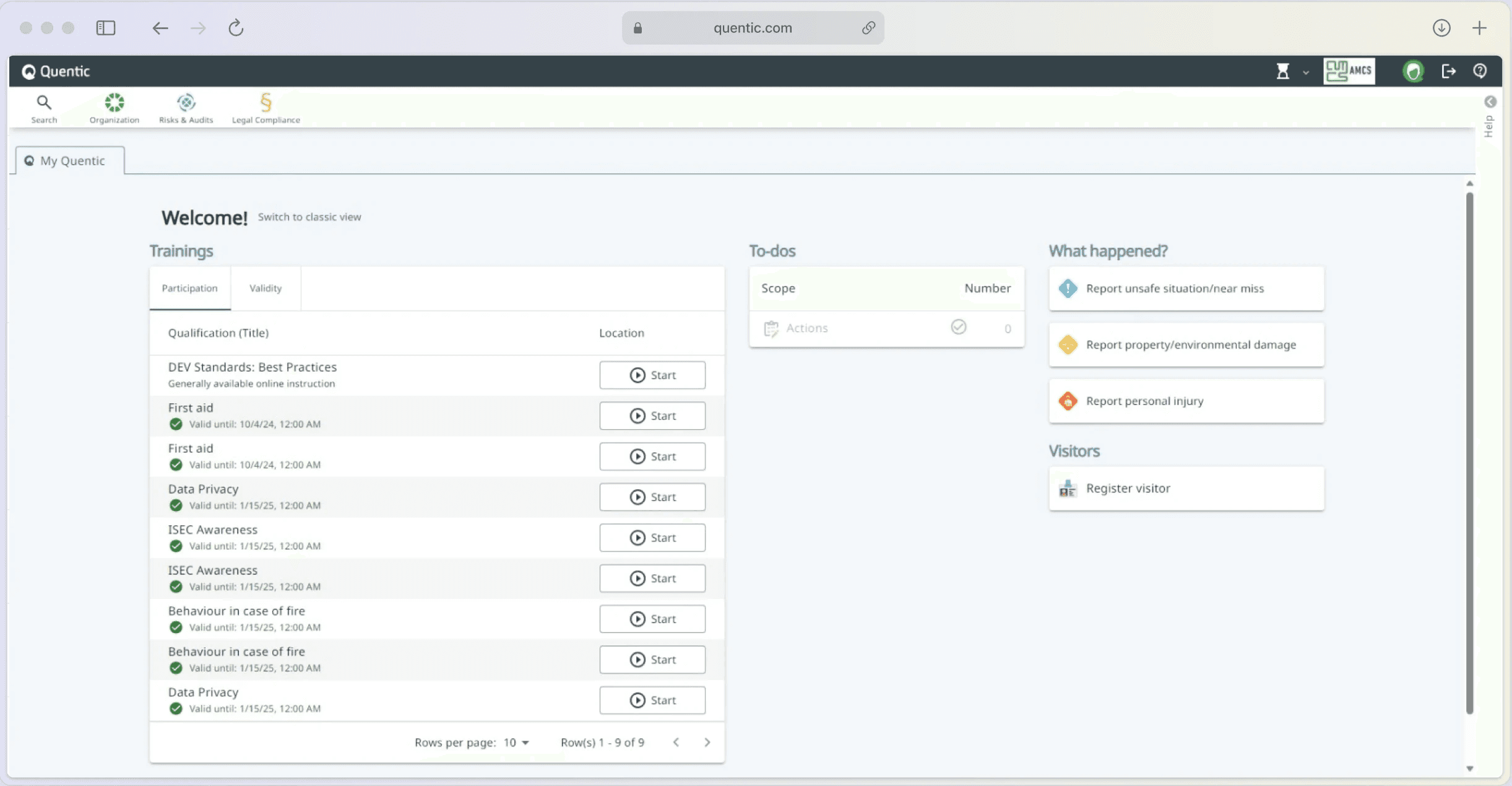
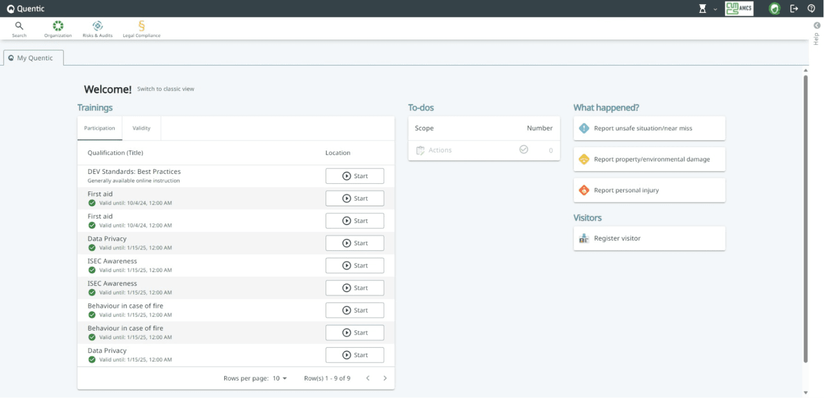
Start page redesign
Challenge:
The original start page design required extensive scrolling and had inconsistent text, making it difficult for users to find necessary information.
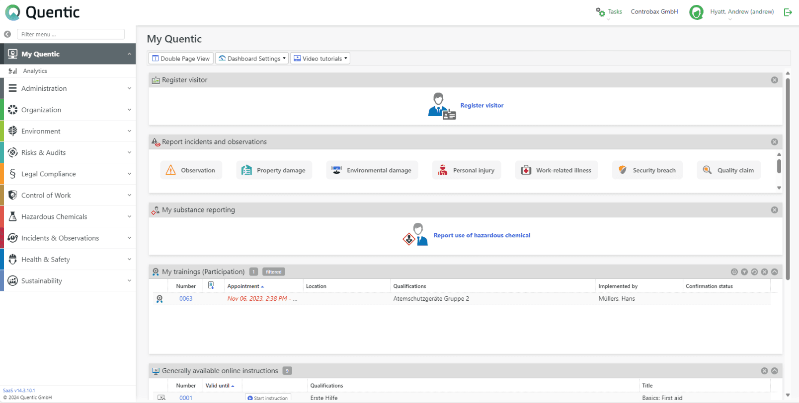
Start page redesign
Challenge:
The original start page design required extensive scrolling and had inconsistent text, making it difficult for users to find necessary information.
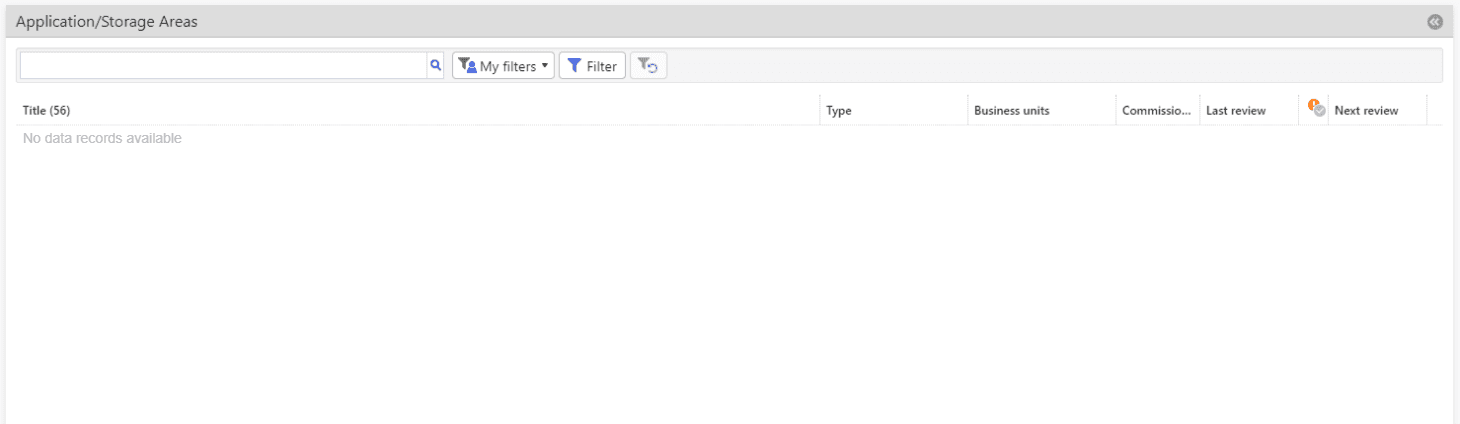
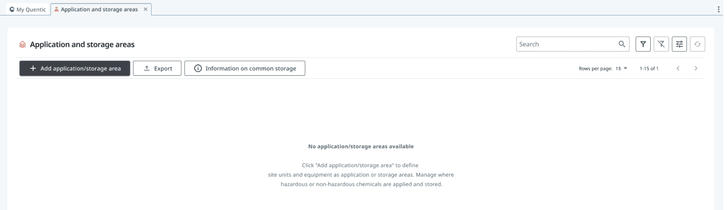
Enhancing Empty State Messages - Turning Gaps into Guidance
Challenge:
The previous empty state messages were generic and lacked guidance.
Solution:
I created actionable messages that not only clarified the absence of data but also offered next steps and helpful information.
Outcome:
This improved user engagement by providing clear paths forward, reducing frustration and confusion.
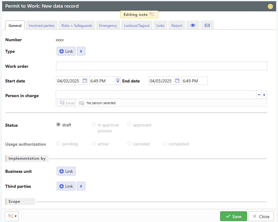
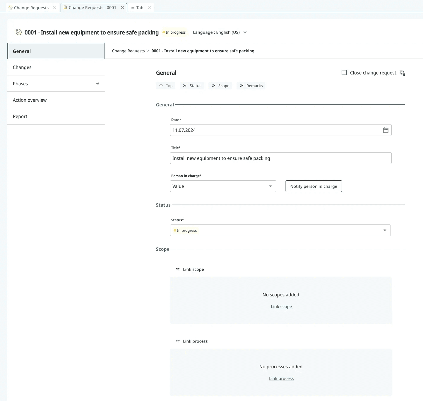
Turning Confusion into Clarity: Data Recording Redesign
Challenge:
The original data recording interface was cluttered and difficult to navigate. Vague labels, inconsistent status indicators, and generic button texts made it hard for users to understand their next steps, leading to confusion and inefficiency.
Solution:
I improved the UX writing by implementing clear, concise, and actionable language. Key enhancements included replacing vague buttons with specific actions (e.g., "Notify person in charge"), highlighting the current status for better visibility, and restructuring the layout to group related fields logically. Additionally, I added contextual prompts to guide users when fields were empty, such as "No scopes added - Link scope."
Outcome:
These improvements made the data recording process more intuitive and efficient, reducing user errors and enhancing clarity. The consistent and structured approach also increased usability, especially when working with multilingual versions of the software.
The art of simplifying complexity
In my journey with the Quentic Platform, I dove into the complexity of user flows and learned firsthand the art of simplifying the complex. Thinking like a user became essential, guiding me to consider every possible scenario and edge case. Through continuous iteration, I discovered the art of unraveling complexity, making the software more user friendly with each tweak. This experience not only sharpened my skills, but also deepened my appreciation for the magic of simplicity in UX design and UX writing.
In my journey with the Quentic Platform, I dove into the complexity of user flows and learned firsthand the art of simplifying the complex. Thinking like a user became essential, guiding me to consider every possible scenario and edge case. Through continuous iteration, I discovered the art of unraveling complexity, making the software more user friendly with each tweak. This experience not only sharpened my skills, but also deepened my appreciation for the magic of simplicity in UX design and UX writing.