
Industry
Health & Safety
Client
Quentic App
UX Writing - App

The Quentic App is a mobile reporting channel for everything related to environment, health and safety, quality, and sustainability.
Role: UX Writer As the dedicated UX writer for the Quentic App, I focused on crafting clear, concise, and user-friendly microcopy tailored for frontline workers. My goal was to create intuitive content that empowers users to complete complex health and safety tasks efficiently, regardless of their technical expertise or language preferences. Key achievements: - Increased user engagement through clearer onboarding microcopy and streamlined login flows. - Improved the login success rate by introducing more intuitive login methods and clearer prompts. - Enhanced user guidance by providing contextual help and concise explanations of complex features. - Developed translatable content strategies to support global use in 35+ languages.
Role: UX Writer As the dedicated UX writer for the Quentic App, I focused on crafting clear, concise, and user-friendly microcopy tailored for frontline workers. My goal was to create intuitive content that empowers users to complete complex health and safety tasks efficiently, regardless of their technical expertise or language preferences. Key achievements: - Increased user engagement through clearer onboarding microcopy and streamlined login flows. - Improved the login success rate by introducing more intuitive login methods and clearer prompts. - Enhanced user guidance by providing contextual help and concise explanations of complex features. - Developed translatable content strategies to support global use in 35+ languages.
A fresh start: Onboarding experience
Challenge:
The original onboarding experience lacked clarity and engagement, making it difficult for new users to understand the app's purpose and key functions. This led to a disjointed first impression, potentially lowering user confidence.
Solution:
I redesigned the onboarding screens with a focus on simple, grammar-friendly, and actionable text. Each screen presented a clear value proposition and practical guidance, allowing users to immediately grasp how the app could support their daily tasks.
Outcome:
The updated onboarding flow created a welcoming and informative first impression, leading to higher user engagement during the initial setup. Users felt more confident navigating the app from the start, thanks to the clear and purposeful language.

User guidance: Info screens
Challenge:
Users struggled to understand core features and their practical applications within the app, as previous info screens were too technical and lacked actionable advice.
Solution:
I revamped the info screens to include concise, user-focused explanations. By breaking down complex functions into simple, clear steps, I made it easy for users to understand how to utilize each feature effectively. I also ensured that the text was translatable and culturally neutral.
Outcome:
The improved info screens enhanced user comprehension of the app’s capabilities, resulting in increased usage of advanced features and a reduction in user support requests.

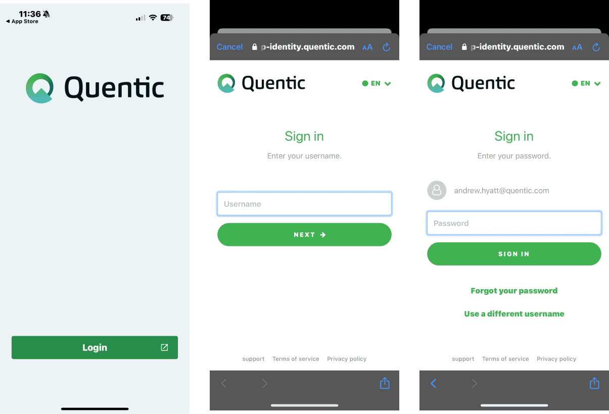
Straightforward user login
Challenge:
The previous login method was complex and time-consuming, requiring users to input their username and password on separate screens. Additionally, there was no clear way to select the company subdomain and tenant in one streamlined flow.
Solution:
To optimize the login experience, I mapped out the user path to identify pain points. I introduced a new login flow that combined subdomain selection, tenant choice, and login credentials in one intuitive sequence. Additional login methods were also incorporated to keep up with modern authentication standards.
Outcome:
The redesigned login process significantly reduced login times and increased user satisfaction. Frontline workers, who often need quick access in the field, reported a smoother and more efficient login experience.
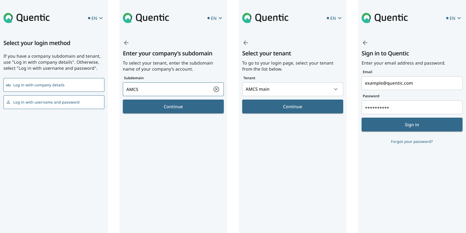
Updated flow To better understand the user path and optimize the login experience, I created a diagram of the updated user login flow. This visualization allowed me to identify what information users need and when, ensuring a logical and intuitive flow.
Updated flow To better understand the user path and optimize the login experience, I created a diagram of the updated user login flow. This visualization allowed me to identify what information users need and when, ensuring a logical and intuitive flow.

After the redesign In the redesign, we added additional login methods to accommodate updated technology. Now, users can select their login method, enter their company subdomain, select their tenant, and then enter their username and password—all within a cohesive and intuitive flow. By prioritizing clarity and ease of use, users can quickly log in, complete their reporting tasks, and return to their core responsibilities without unnecessary interruption.
Want to work together?
Feel free to reach out for collaborations or just to say hi!
© 2024 Andy Hyatt. All Rights Reserved.
Want to work together?
Feel free to reach out for collaborations or just to say hi!
© 2024 Andy Hyatt. All Rights Reserved.
Want to work together?
Feel free to reach out for collaborations or just to say hi!
© 2024 Andy Hyatt. All Rights Reserved.